Vintage journaling ideas, printable tips, and beginner-friendly inspiration
Explore practical junk journal tutorials, printing tips, layout ideas, and creative ways to use vintage-style printables in your pages, gifts, and paper projects.
Why Your Junk Journal Pages Look Messy (And How to Fix It Fast)
A junk journal page rarely looks messy because you “used too many elements.” What actually creates visual chaos is the absence of hierarchy, inconsistent spacing, and competing focal points that pull the eye in multiple directions at once. Most beginners try to fix this by adding more decorations to “balance” the page, but this usually makes the problem worse because it increases visual noise instead of organizing it. If your pages feel overwhelming or unfinished, the issue is structural, not aesthetic, and once you correct the structure, the same materials suddenly start looking curated and intentional.
If you want ready-made elements designed to work within these rules, you can use a structured printable set like this one:
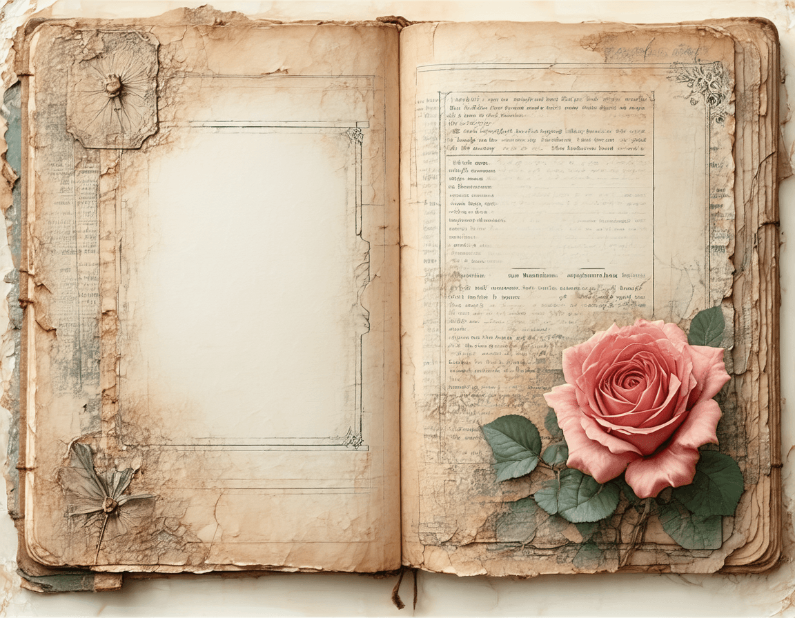
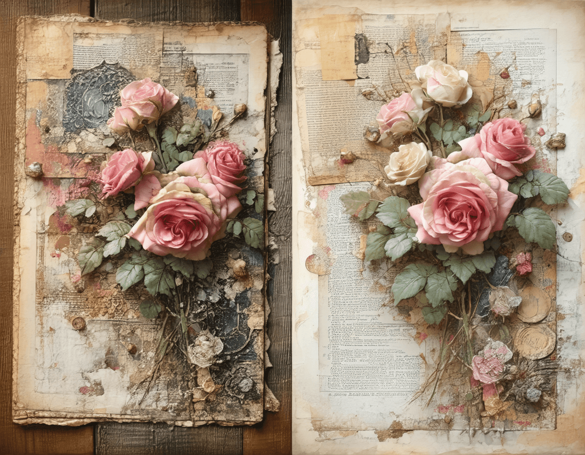
Roses De France Printable Junk Journal Kit, Vintage Papers & Ephemera, A4 + US Letter - Etsy UK
1. You Have More Than One Focal Point (And Your Eye Gets Confused)
The fastest way to destroy visual clarity is placing multiple medium-sized elements that all demand attention equally. When nothing is clearly dominant, the eye keeps jumping instead of settling, which creates that “messy” feeling even if every individual element is beautiful.
A strong page always has a single visual anchor, usually a larger floral cluster or a defined composition block, while everything else supports it. If you suspect this is your issue, remove or reduce the second-largest element first, not the smallest ones, because clutter is almost always caused by competing importance, not quantity.
2. Your Background Is Fighting Your Design
Many junk journal pages fail before you even place the first sticker, simply because the background has too much contrast, pattern, or visual weight. Dark ledger lines, heavy stains, or strong scripts can overpower delicate florals and make the entire page feel compressed and noisy. A functional rule is that your background should always be one level quieter than your main element, meaning lower contrast, softer texture, and less visual interruption. If your page feels busy and you don’t know why, place a light neutral panel behind your focal element or switch to a softer paper base, and you’ll often fix the entire composition without changing anything else.
3. You’re Placing Elements Randomly Instead of Structurally
Random placement creates randomness in perception. When elements float without alignment or edge anchoring, the brain reads the page as unstructured, even if the pieces themselves match stylistically. To correct this, anchor your main element to an edge (corner or margin), align at least one supporting element to it (such as a label or text line), and keep one intentional empty area for breathing space. This creates invisible structure lines that guide the eye, which is why even simple layouts suddenly look “designed” instead of assembled.
4. You’re Trying to Fill Every Empty Space
Empty space feels uncomfortable, especially when you’re working with beautiful materials, but filling every gap is one of the fastest ways to ruin a page. Negative space is not wasted space; it is what defines your composition and allows the focal point to stand out. When you remove the pressure to “complete” every corner, your page immediately becomes calmer and more readable. A practical fix is to designate one area that you deliberately leave untouched, which forces the rest of the composition to organize itself around a clear visual break.
5. You’re Mixing Too Many Styles at Once
Vintage, botanical, lace, handwritten script, stamps, labels — each of these can work beautifully, but when they are all used at the same intensity, the page loses coherence. The problem is not the elements themselves, but the lack of a dominant style direction. Choose one primary style (for example, Victorian floral) and let everything else act as a supporting layer rather than an equal participant. This reduces visual conflict and creates a unified look that feels intentional rather than accidental.
6. The Fast Fix Method (Use This When a Page Feels “Off”)
When a page doesn’t look right and you don’t know why, don’t add more elements. Instead, apply this quick correction method:
Remove the second most dominant element
Move the main element closer to an edge
Add one small functional detail (label or date)
Leave one area empty on purpose
In most cases, this takes less than two minutes and solves the problem more effectively than starting over.
7. Why Printable Elements Make This Easier
Printable elements, when designed consistently, eliminate one of the biggest sources of clutter: mismatch. When all elements share the same color palette, style, and scale logic, they naturally fit together without forcing you to constantly adjust. This is why curated printable sets often produce better results than mixing random pieces from different sources. If you want a cohesive starting point, you can use a structured printable collection here:
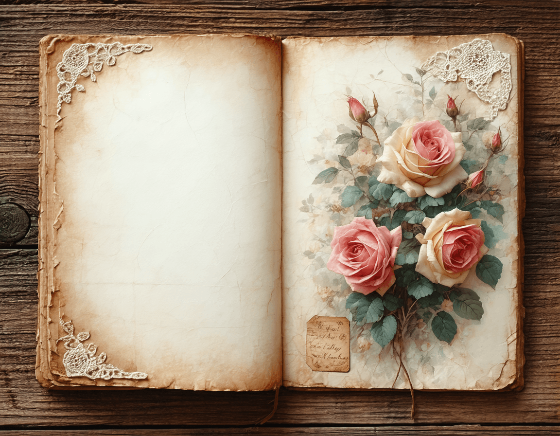
Roses De France Printable Junk Journal Kit, Vintage Papers & Ephemera, A4 + US Letter - Etsy UK
FAQ — Quick Answers to Common Problems
Why do my junk journal pages always look cluttered?
Because multiple elements compete for attention or there is no clear focal point guiding the eye.
How many elements should I use on one page?
There is no fixed number, but one dominant element and one supporting element is usually enough for a clean layout.
Is empty space really necessary?
Yes. Without negative space, your page has no visual structure and becomes overwhelming.
What’s the easiest way to improve my layouts instantly?
Remove one element and reposition your focal point closer to an edge.
Do printable stickers look less “authentic” than handmade elements?
Not if they are well-designed. Consistency often makes them look more curated, not less.
Closing Thought
A messy page is not a sign that you lack creativity. It’s a sign that your layout lacks structure. Once you understand how focal points, spacing, and hierarchy work together, even simple elements can produce results that feel intentional, balanced, and visually calm.
If you want to build that consistency faster, start with elements that are already designed to work together:
Roses De France Printable Junk Journal Kit, Vintage Papers & Ephemera, A4 + US Letter - Etsy UK